


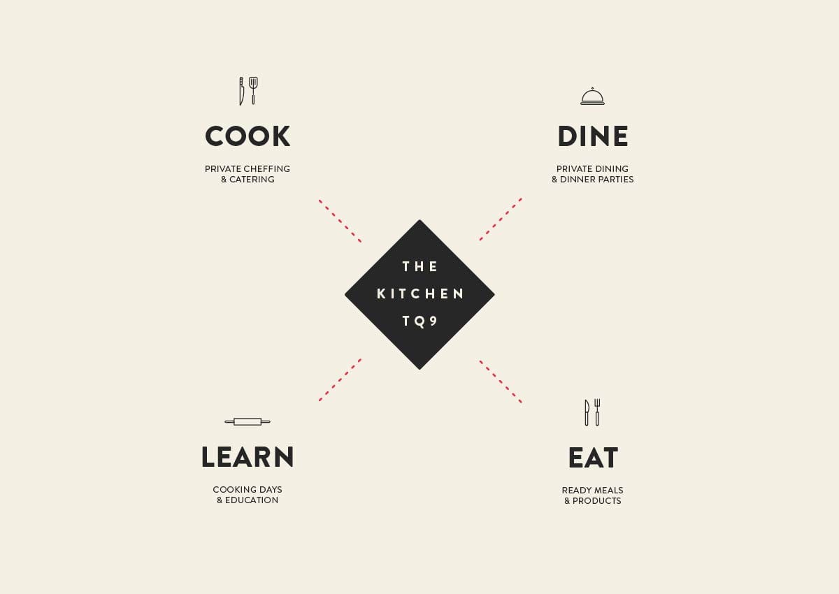
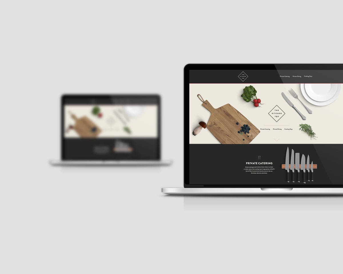


The Kitchen TQ9 is a business with many sides. It’s the brain child of Chris Sherville. Chris is a private chef and will be opening a private dinning area in his own home. On top of this, he will also be building a large kitchen to offer educational cooking days.
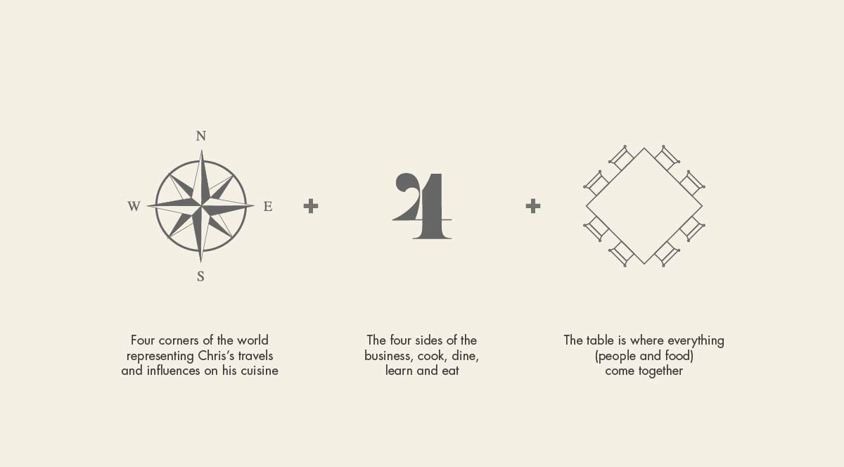
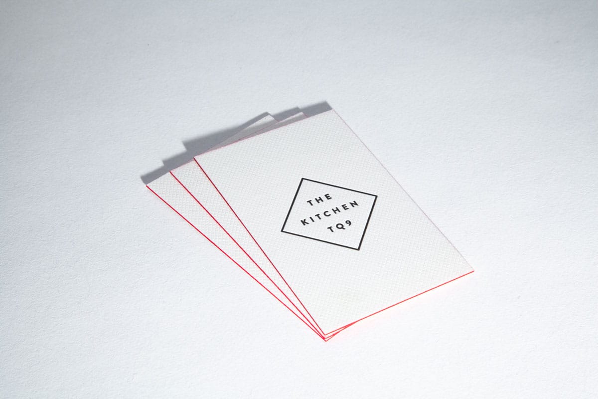
The foundation of the logo primarily came from the four sides of the business, but also Chris’s love of infographics. We found a seed of a idea in a table plan, the place where the entire cooking experience comes together.
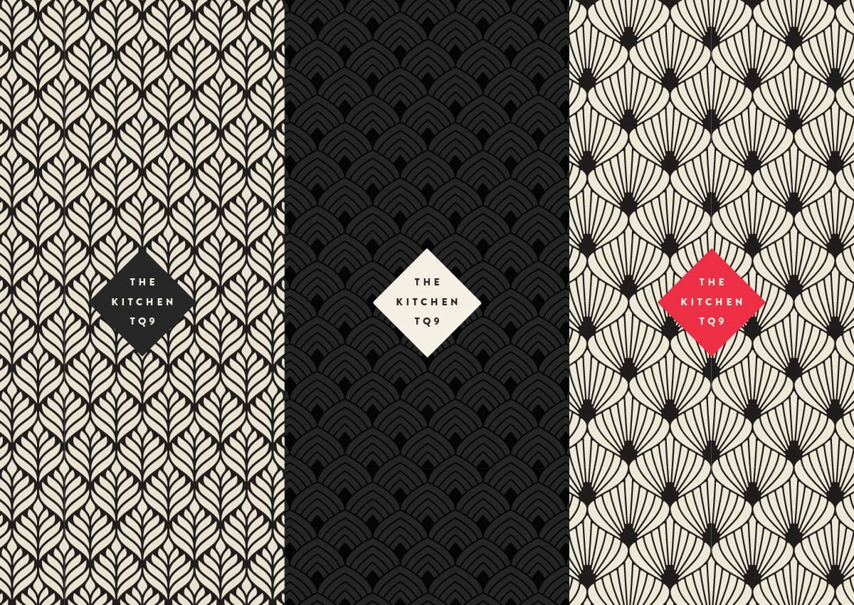
The brand had to capture the high end, premium, private chef side of the business, but also it needed a fun and approachable side for the educational cooking days.
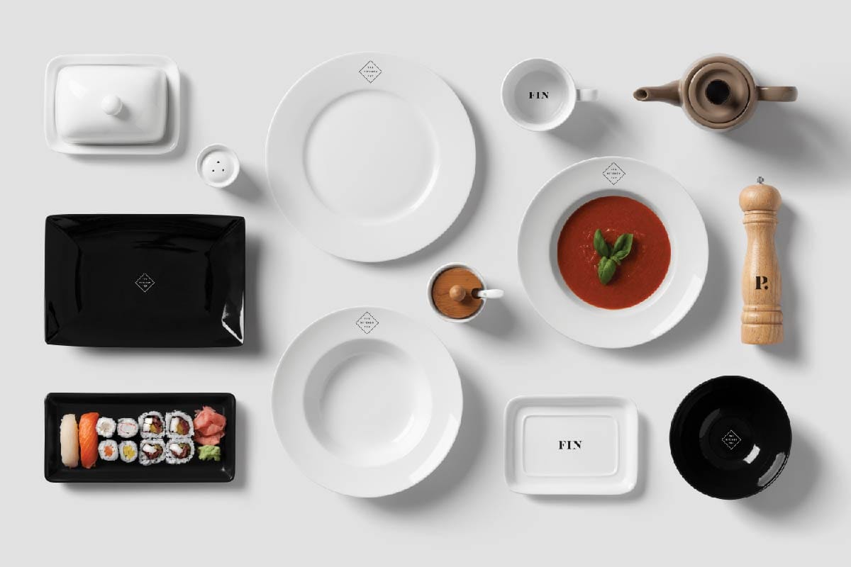
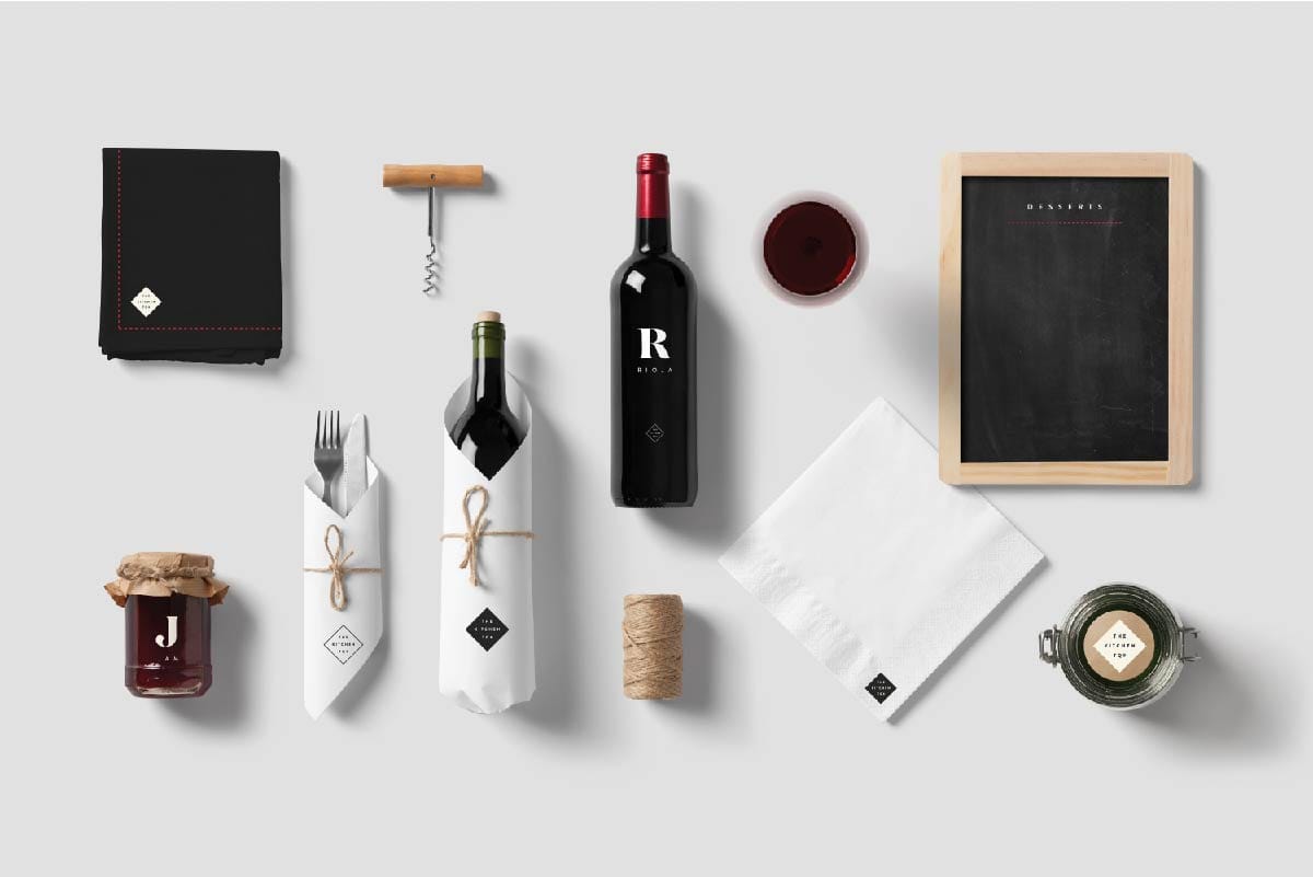
This was achieved by having two contrasting tones, a dark, more atmospheric side for the private chef and a lighter side that makes use of a fun infographic style throughout the brand.
If you are looking to build a brand, start a company or perhaps you need a new website, feel free to email us directly to discuss.